Are you ready to learn how to create an awesome logo that will make your projects stand out? Today, let’s look at how I created this fun logo based on my original character – Franca!
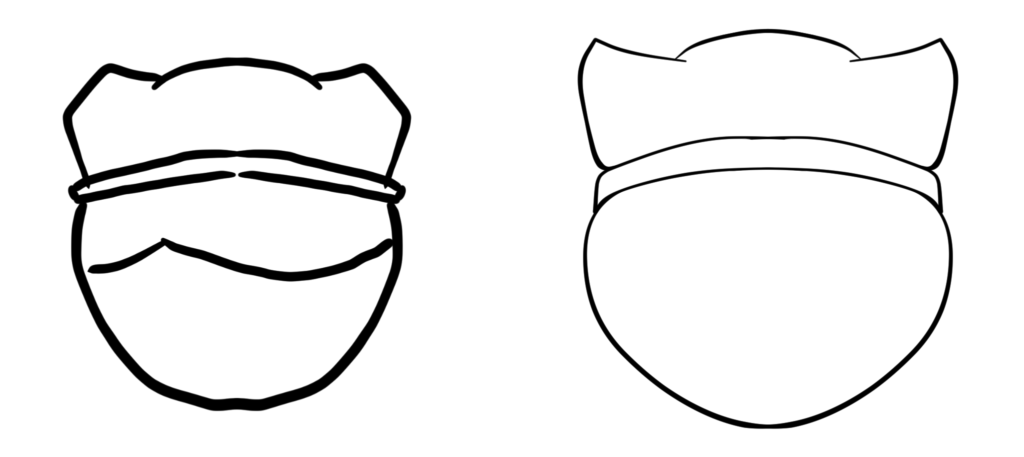
Using the digital art program, Clip Studio Paint, I started by roughly sketching out Franca’s head shape. It looked a bit wonky at first, but I experimented with different angles. I ended up drawing Franca looking downwards to emphasize her neotenous features, which make her look cuter!

With the symmetrical ruler tool in Clip Studio, I drew the head symmetrically, but added a touch of asymmetry with Franca’s signature hairstyle brushed to the right. A bit of asymmetry can add a lot of personality and flavour to your design!

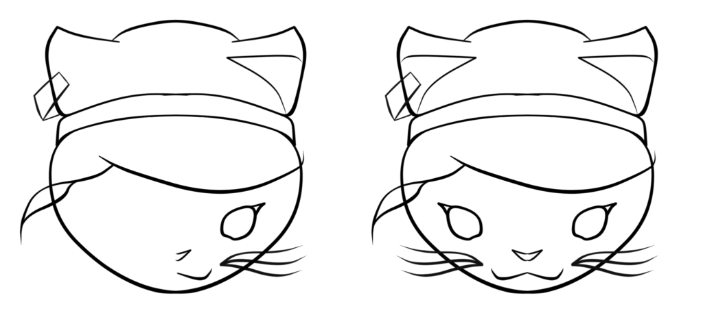
After cleaning things up with a new vector layer, I began drawing in the facial details. Again with the symmetrical ruler, it’s so easy to draw a character from a front view – features such as the eyes are perfectly mirrored over!

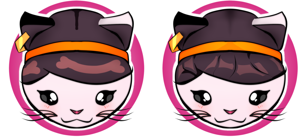
Next, it was time to add in some colours and details. Blocking in the colours was super quick and easy, but I felt like something was missing. Having only flat colours can look a bit dull. But, adding some lighting and shading can make a character come to life! With some finessing of the lighting and shading, smoothing it out with some blending tools and cutting into the shapes with the eraser tool, Franca came to life with a cute, circular shape language.
The highlights on her hair were a bit tricky, but after some tweaking to coordinate the individual highlights’ shapes while trying to illustrate a cohesive hair flow, I got the final result by blocking in some large highlights, and then cutting away using the eraser tool to create several separate highlights.

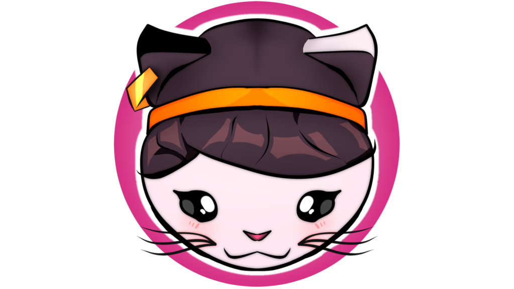
And, voila! The final result is an awesome logo for my website and other projects. Stay tuned for more creative projects, including Franca’s upcoming collaboration with the SteeBee honey company! Thanks for reading, and I can’t wait to show you more in my next article, where I’ll tell you the story of my online art gallery!

