Hey there, and welcome back to my blog (it’s been a while)! This time, we’ll be talking about how I created this cool PENTEL mechanical poster!
The creation of this poster began as an exercise in using the software Autodesk Maya. This is a 3D modelling software in the same vein as Blender – unlike Blender, however, Maya has a really expensive monthly subscription fee! Hence, I’ve never really touched it. However, Maya is used very widely “in the industry”, so it’s a good idea to be at least a little familiar with it. And thanks to my old university student ID card, I was able use Maya for free with a student license. Cool!
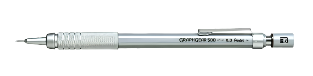
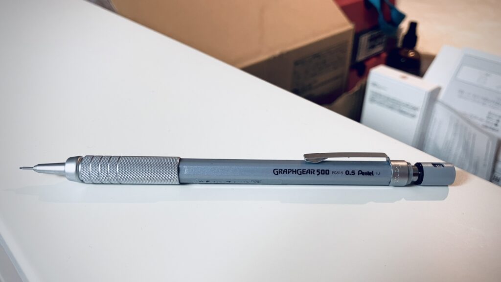
As I was saying, to practice my Maya skills a mechanical pencil seemed like a pretty good project to tackle – not too complex like a full character, but an interesting enough shape to really test myself. The pencil I ended up modelling was the Pentel Graphgear 500, which I specifically bought for its cool design!
Modelling
The first step in modelling was to take some reference pictures of the pencil. I took some pictures of the pencil from top and side views, which we can bring into Maya to model on top of.
We can keep the modelling process simple by thinking about the different parts that make up the pencil – at the factory, these pencils are made of several pieces assembled together. We’ll model it in a similar fashion!
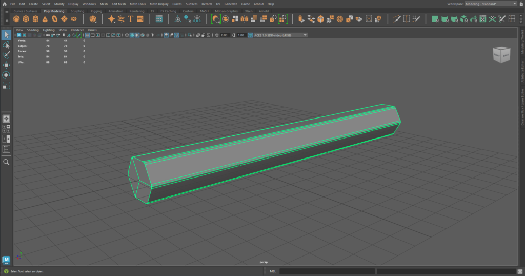
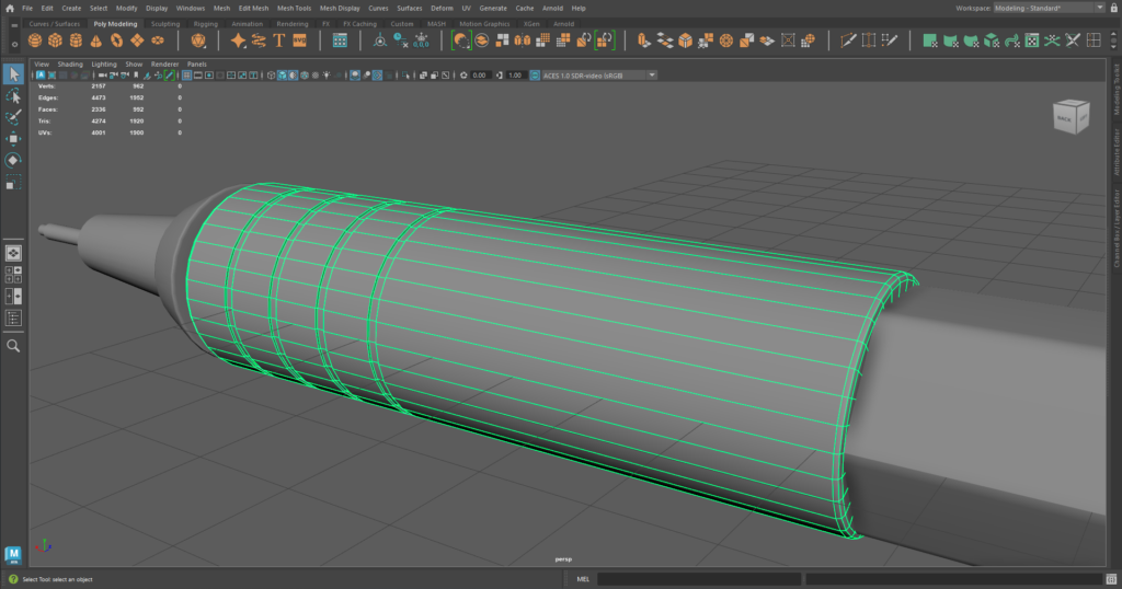
In total, I ended up modelling the pencil in 10 different parts. That sounds like a lot, but most of those parts were very little things, like the bit of lead sticking out the end.
The part that gave me the most trouble was the “ring” of the pencil, since it had a clip-like component at the bottom. Attaching the two components whilst keeping a consistent thickness was a little difficult!
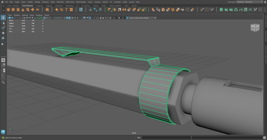
Another part that was interesting to model was the “grip” of the pencil. Notice how towards the tip of the pencil, there are four grooves on the grip. I modelled those by creating four uniform loop cuts, bevelling them, and then extruding the geometry inwards!
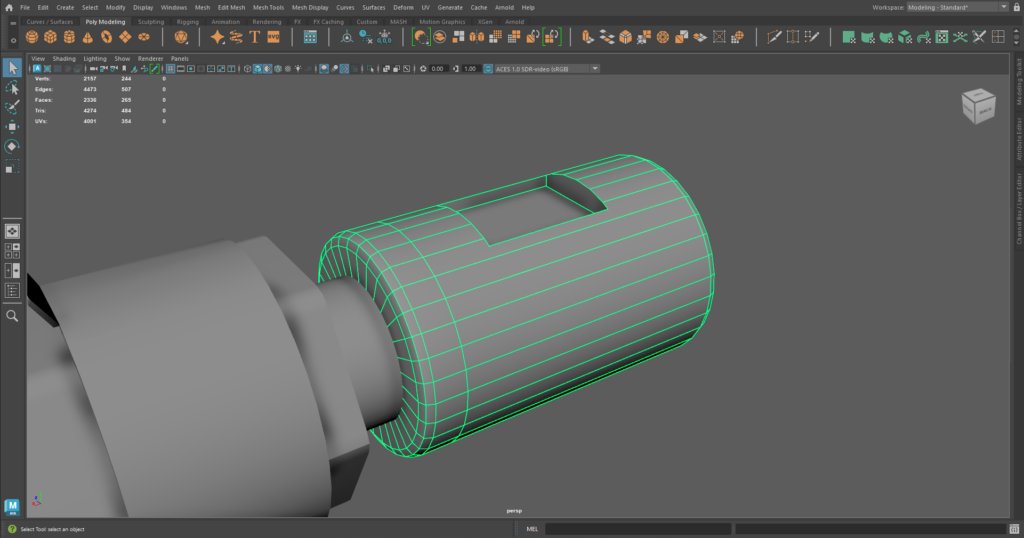
There was also the “cap” of the pencil, which is essentially a cylinder with a cube cut into it. This was quite simple to model, since we can use a Boolean operation to subtract the form of one mesh from another. In this case, I subtracted a cube from the middle of a cylinder!
And with that, all the parts of the mechanical pencil have been modelled! Putting them together, I think already it’s looking pretty good. But of course, we have some ways to go before it starts looking realistic!

Texturing
Now that the components of the pencil have been modelled, let’s give our pencil some texture! One nice thing about Maya is that it’s super simple to give photo-realistic materials to your models – we can simply use the Ai Standard Surface material and adjust the settings as we need!
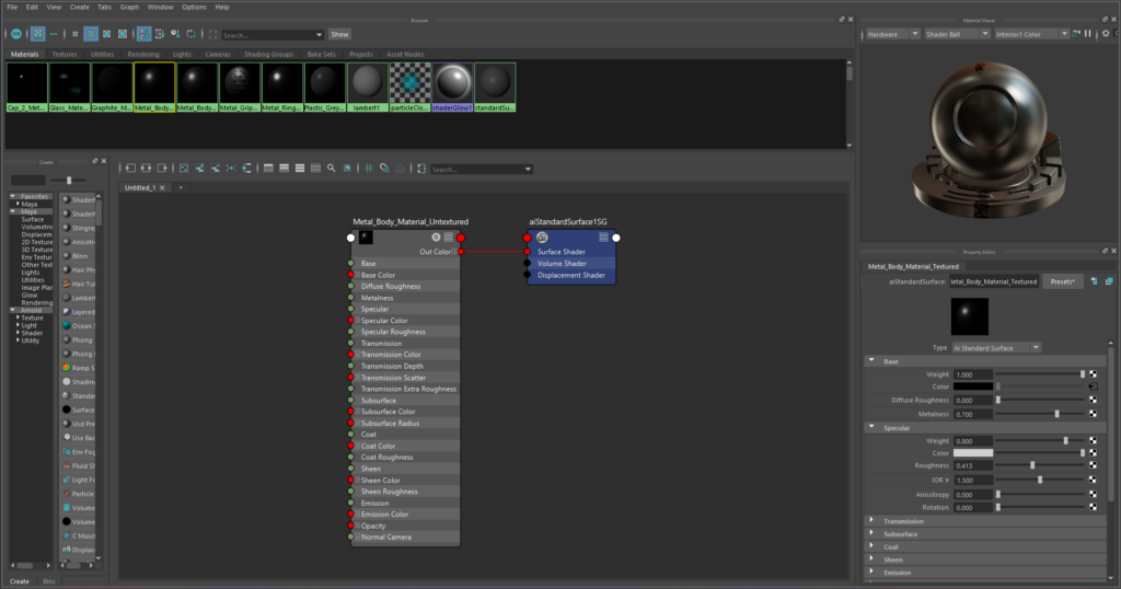
The Ai Standard Surface material is kind of like a generic “realistic” material with a bunch of options you can tweak to create all kinds of things – from metals, to clay, to glass…basically anything you could ever want!
For example, to create the “body metal” that comprises the body of the pencil, I simply turned up the Metalness parameter, as well as specified a light-greyish colour matching my reference image. Super simple!
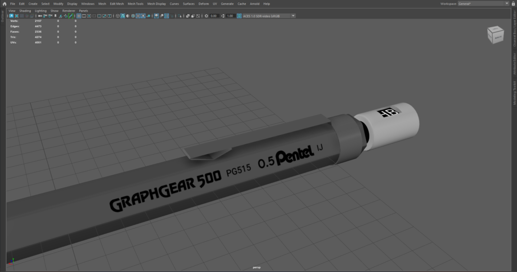
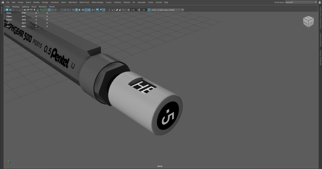
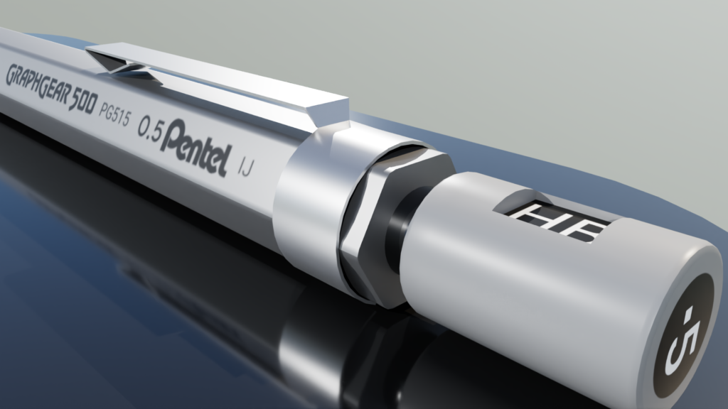
For other parts of the pencil, I needed to apply image textures to draw on the details. Note the text on the side and on the cap!
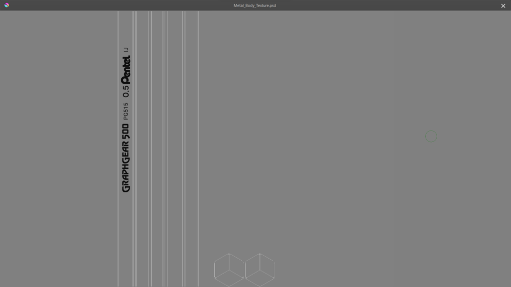
To get the text on, first we’ll have to create those image textures! Inside Krita (a digital drawing software), I put a bunch of logos and text inside the leftmost rectangle – that rectangle represents the plane/geometry on which I want my image projected!
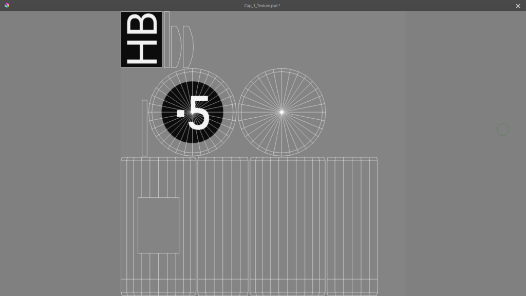
I’ll do something similar with the cap of the pencil! Note how the circle around the “.5” represents the geometry at the top of the cap.
And here’s how it looks back in Maya!
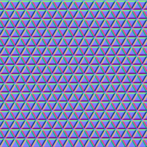
To create the triangular-bumpy texture of the grip, we can use a normal map! A normal map is a special image we can use to add details and textures to surfaces without increasing the complexity of our 3D model!
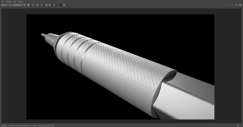
By using a normal map of a triangular pattern, we can create that same bumpy triangle texture on our model. And it’s all done by simply plugging this image into our Ai Standard Surface material! Again, super simple stuff!
Rendering
With our materials all set up, it’s time to render our model! We can begin by creating a three-light setup (key, fill, and rim lights) that is a staple in professional photography. The key light illuminates the pencil, the fill light softens the harsh shadows, and the rim light emphasises the edges of our subject.
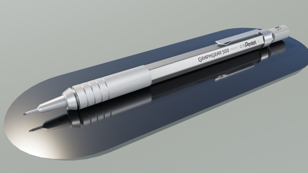
I also created an environmental Sky Dome Light, which helps to make the scene look a lot more natural. Essentially, the sky dome is a big dome above the scene that mimics the lighting that comes from the sky.
I created a shiny metal plate for the pencil to rest on, mainly to help the pencil stand out from the background. The plate is shiny as well, which gives us some cool reflections!
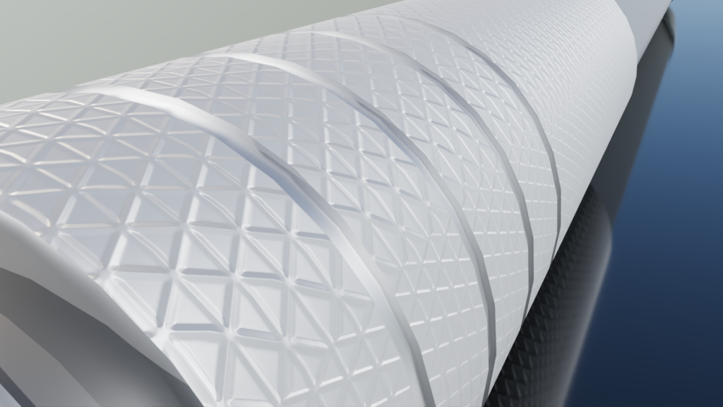
This third render shows off the normal map’s effect on the grip! I think it could be just a bit sharper if I used a higher resolution normal map – something to keep in mind for next time!
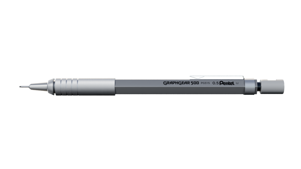
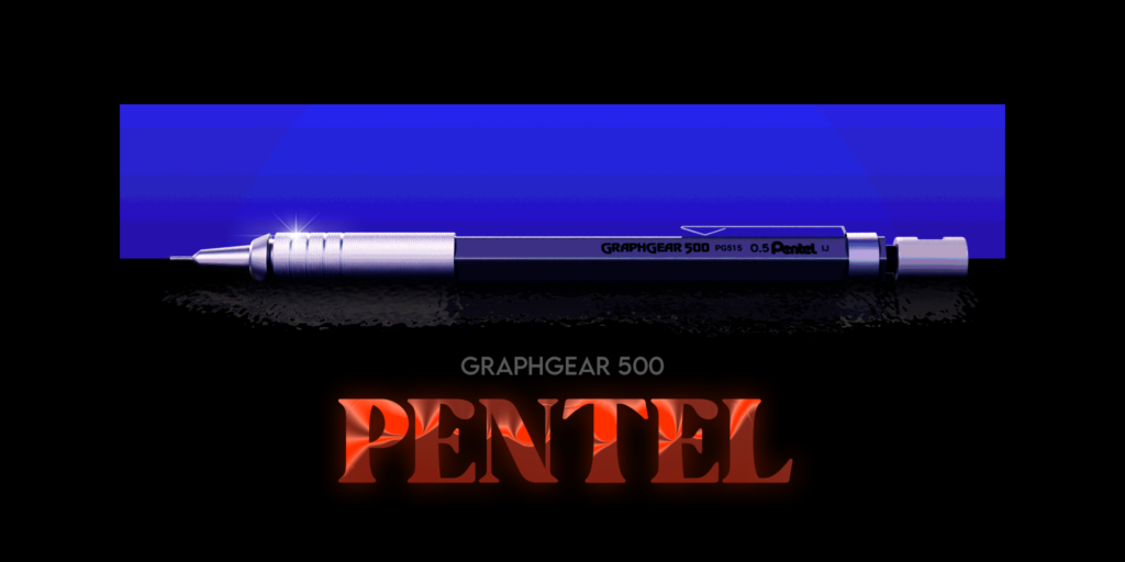
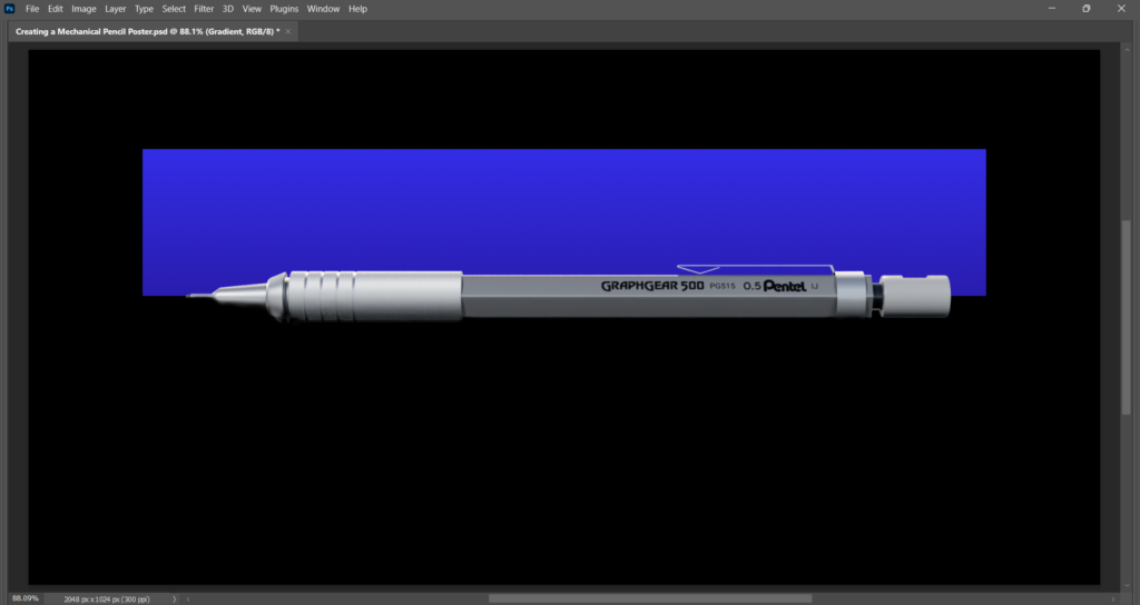
To create the PENTEL poster, I also created an orthographic render of the pencil in a side view. For this one, I chose not to render the background or the metal base. I didn’t need the base at all, and I would create a new background in Photoshop!
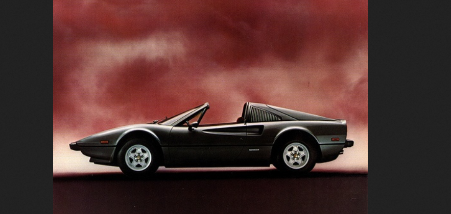
In creating the orthographic side-render, I was inspired by this cool car advertisement. As far as I know, it’s an advertisement from 1981 for the Ferrari 308. I’m not really a car person, but I think this looks pretty cool!
Photoshopping
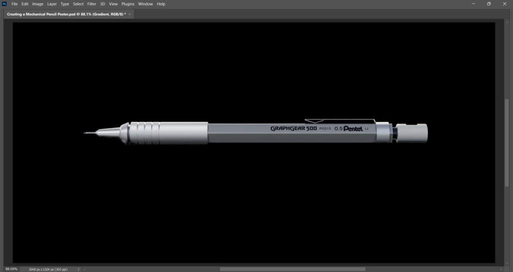
Let’s work on the side-render in Photoshop to get it looking like a cool poster! Normally I don’t use Photoshop because I’m not a fan of their subscription model, but in this case I thought it would be some good practice. Like Maya, Photoshop is widely used in the industry so it’s good to have some familiarity with it.
Let’s start by placing our rendered pencil in the middle of our black canvas.
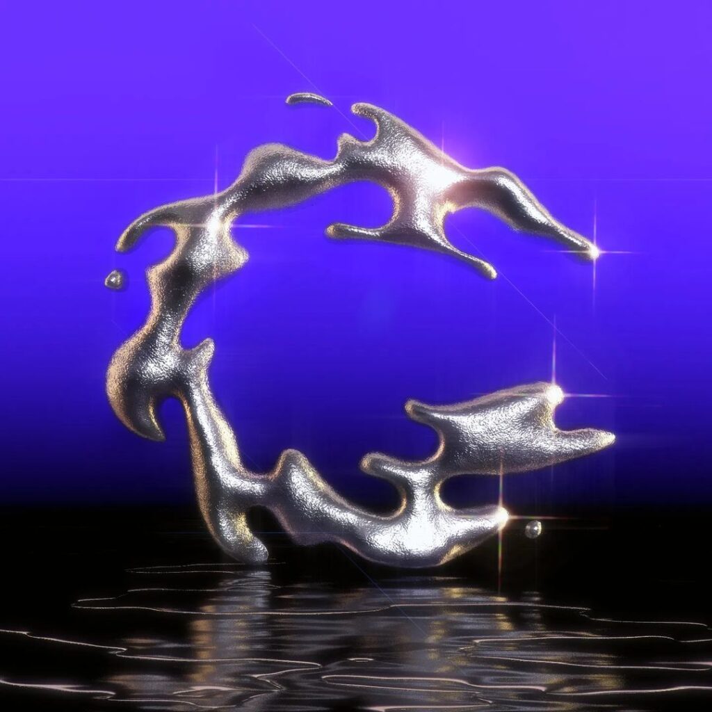
Let’s create some contract between the pencil and the background! To do so, let’s take some inspiration from this awesome design from kushlet.
I’ll create a rectangle around the pencil, and then fill it with a blueish gradient.
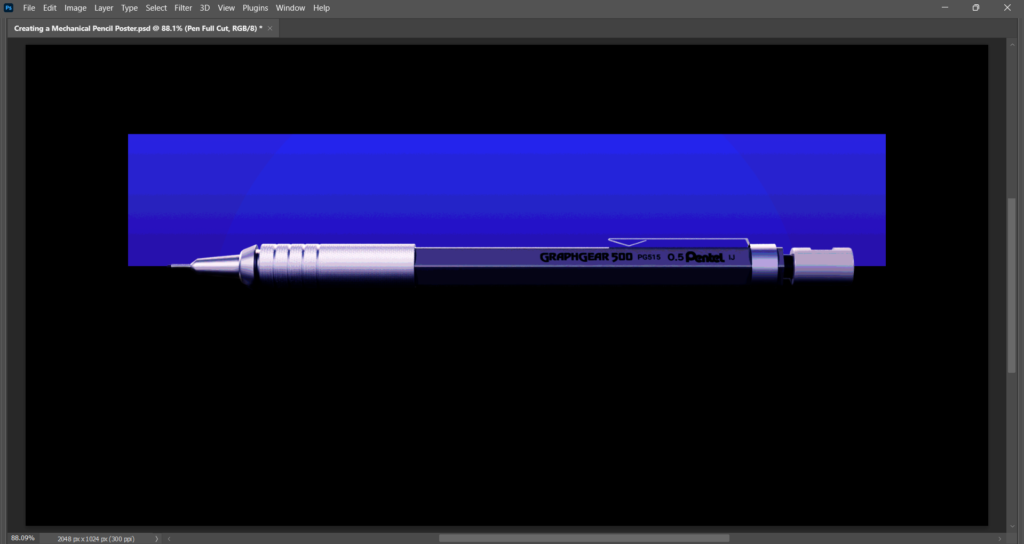
I’ll then play around with the colours for a little bit, as well as add a posterize effect – this effect reduces the number of colours in an area. This makes it look like a bit like printed poster!

Next, let’s get our pencil render looking a bit nicer. First, I’ll add a Posterize effect to get that poster-look like the background behind it.
Next, I’ll add a colour balance effect since the pencil is too grey and looks a bit boring – I’ll increase the amount of blue in the shadows, and add a little red / remove a little green from the highlights.
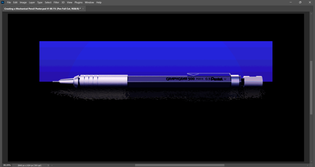
I’ll add a tone curve effect to increase the contrast of my render – the highlights are brighter and the shadows are darker. This also has a cool effect of making the bottom of the pencil blend into the black background, which I think looks very cool!
Next, I’ll add a really subtle reflection below the pencil, making it look like it’s sitting in a dark pool of water. It’s not super noticeable, but it creates the illusion that the pencil exists in an actual environment rather than floating in the void.
Next, let’s add some text at the bottom! For this, I was inspired by the striking red text of this Friday the 13th poster. I thought it would be funny to create the aesthetic of a killer pencil, and the red would be a good contrast to the blue backdrop.
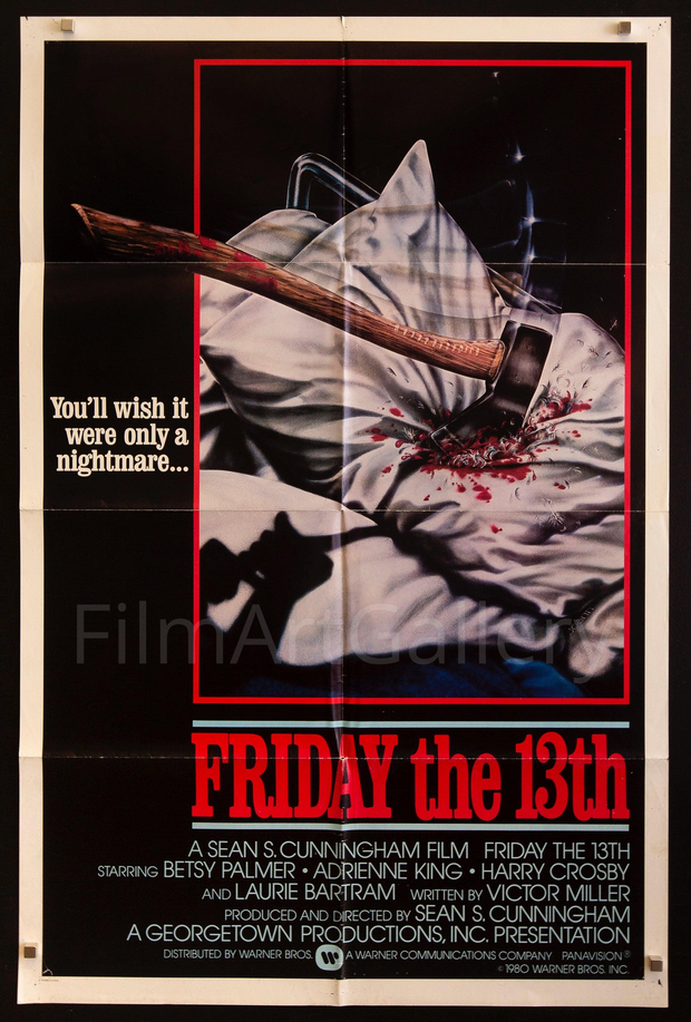
For the “PENTEL” text I used a font called Bright, and for the “Graphgear 500” text I used a font called Lemon Milk! You can download them both for free by using the links I’ve provided!
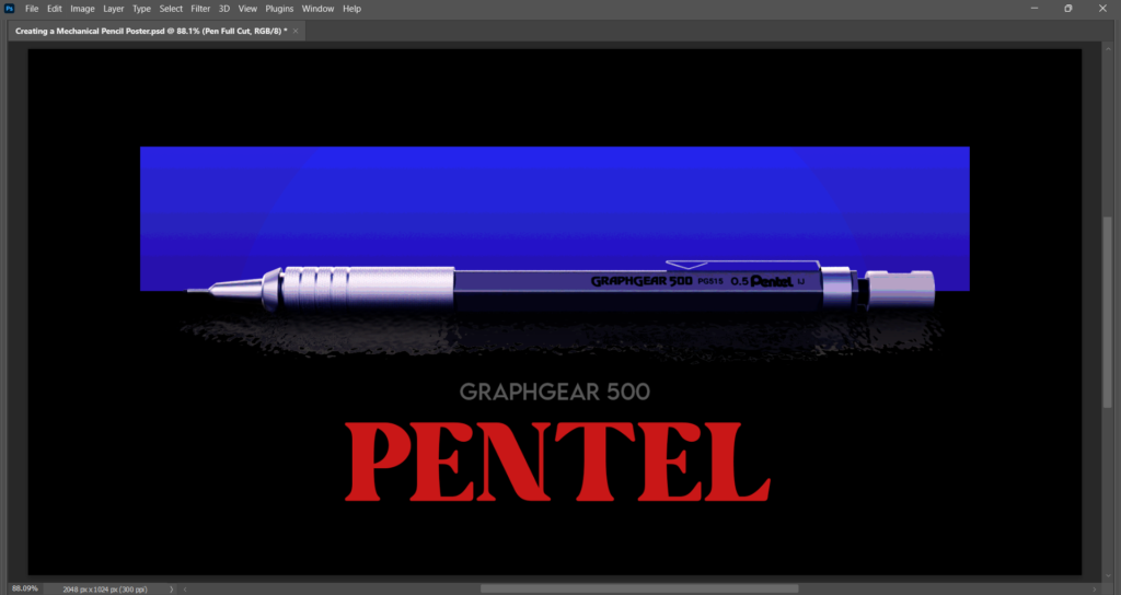
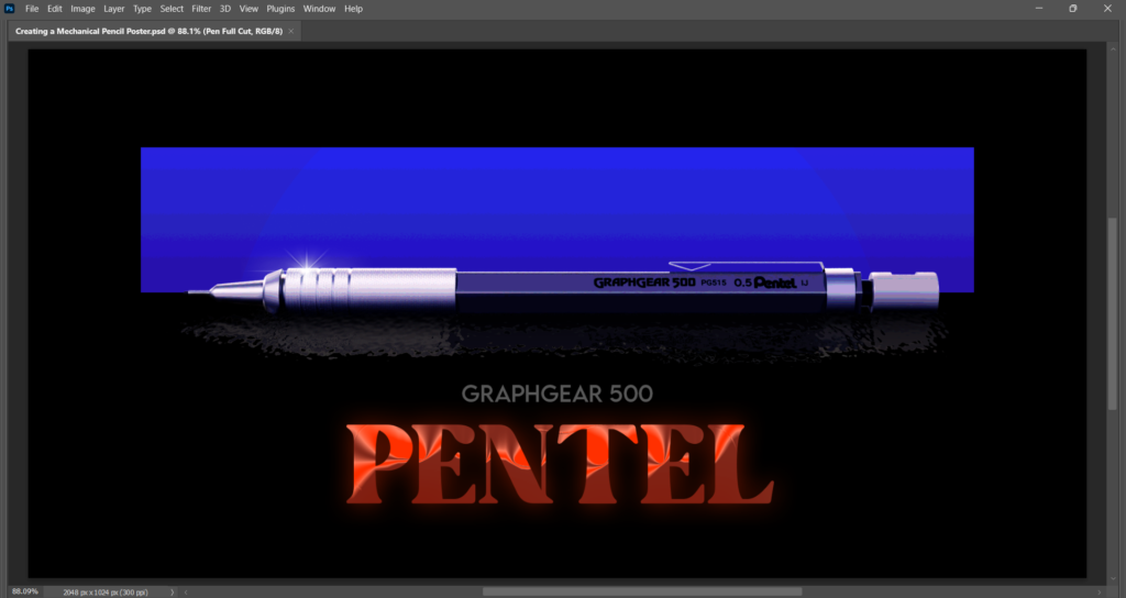
Finally, I’ll apply some bevel and glow to the Pentel text – these particular effects come courtesy of the good people at CHROMETYPE who provide some really awesome Photoshop effects for free if you join their Discord server. Highly recommended!
I also stuck a little lens flare effect to the pen – this lens flare also came from the CHROMEKIT!
And with that, our mechanical pencil poster is now finished! I hope it’s been an interesting to read about its creation, and maybe you’ve been inspired to create your own posters of various objects around the house! It just goes to show that with a little creativity, you can make just about anything look cool and appealing! Thank you for reading, and see you next time!