Do you ever feel like your photos or artworks are almost there, but could use that extra wow factor? With the help of the software DaVinci Resolve, we can manipulate colours to make any image stand out!
DaVinci Resolve is a video editing software, much like Adobe Premier Pro, but with the added bonus of being completely free to use! You don’t have to be a professional to have access to its awesome features. And even though we won’t be editing a video today, we’ll still be able to utilise DaVinci’s colour grading tools to make our image really pop!
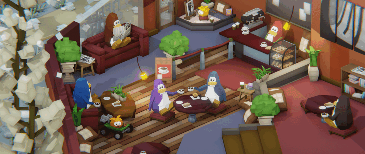
Let’s talk about the image we’ll be working with today. It’s an artwork I’ve made called Espresso con Puffle and it needs a little extra oomph to truly shine. So, let’s fire up DaVinci Resolve and get to work!
(Note: Want to learn the step-by-step process for colour grading in DaVinci Resolve? Check out the video lectures that I used as a reference for this article. They’re super helpful!)
Colour Balancing
Let’s dive into the magic of colour grading! The first step is to import your initial image into the program.
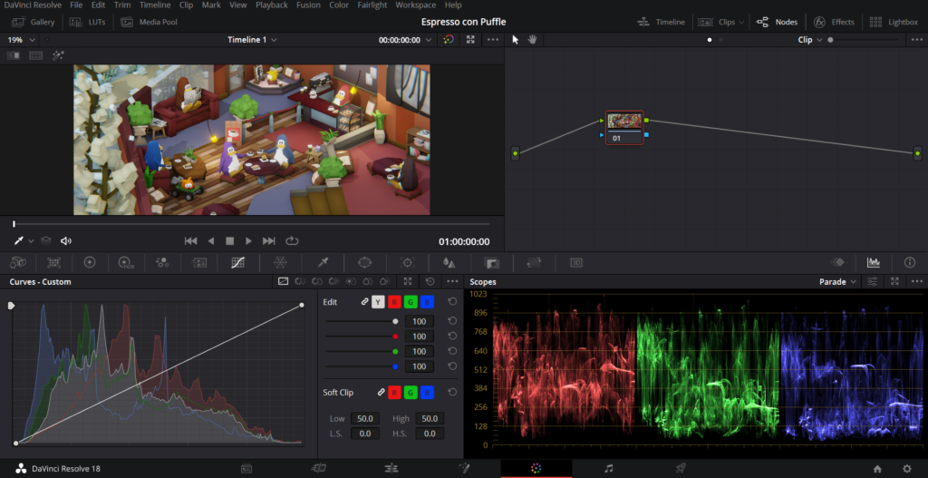
As you can see from the screenshot, there are a plethora of tools at our disposal! We can tweak everything from the brightness to the contrast to the hue, and everything in between.
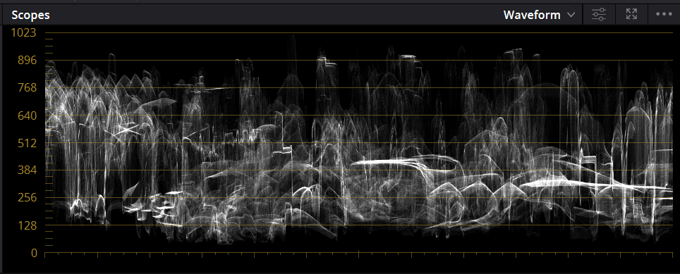
First, let’s visualise the luminance, or brightness, of the image. Take a look at the graph above – it shows us the range of luminance levels available to us. Ideally, we want to make use of the entire range, from the darker colours at the bottom to the lighter colours at the top. This will help create a dynamic and eye-catching image!
Let’s take a closer look at that waveform – it matches the artwork at the top of the screen! The graph tracks the luminance levels across the image. We can easily see that the left side of the image, with the lightly coloured trees and snow, is brighter than the right side with the carpet.
Using the waveform to quantify the colour balance of our image is really helpful, especially for busy artworks with many different elements. It allows us to adjust the image whilst understanding exactly what we’re doing!
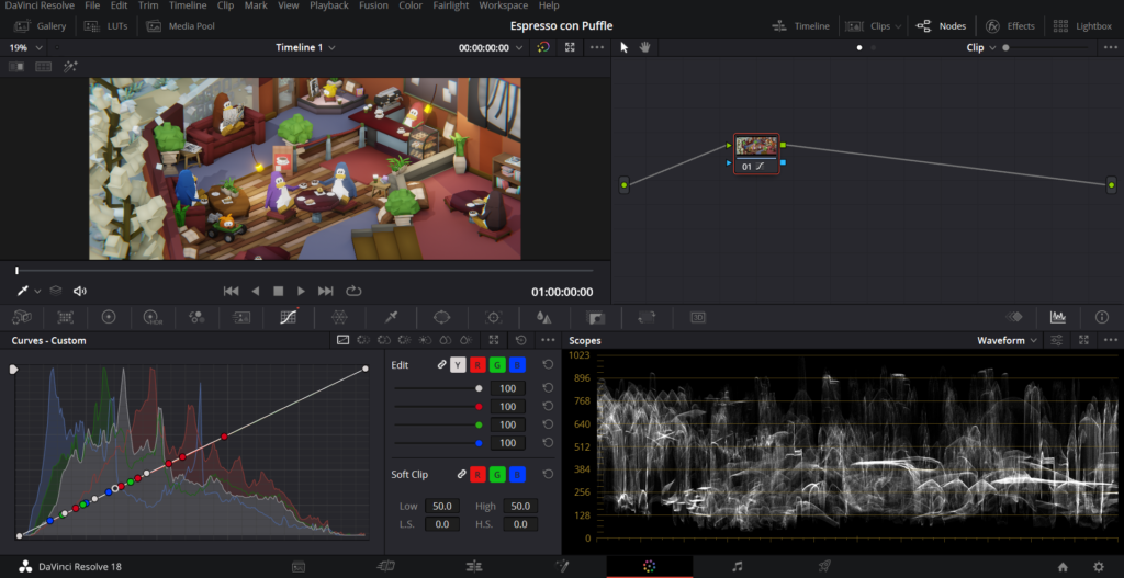
Next up, we have the colour wheels. These are essential for adjusting the colours in our image. The lift wheel controls the shadows, gamma controls the midtones, and gain controls the highlights. By moving these wheels, we can alter the overall balance of the colours in our image. We can also use the black slider to adjust the luminance of each wheel. Experimenting with these settings can lead to some awesome results!
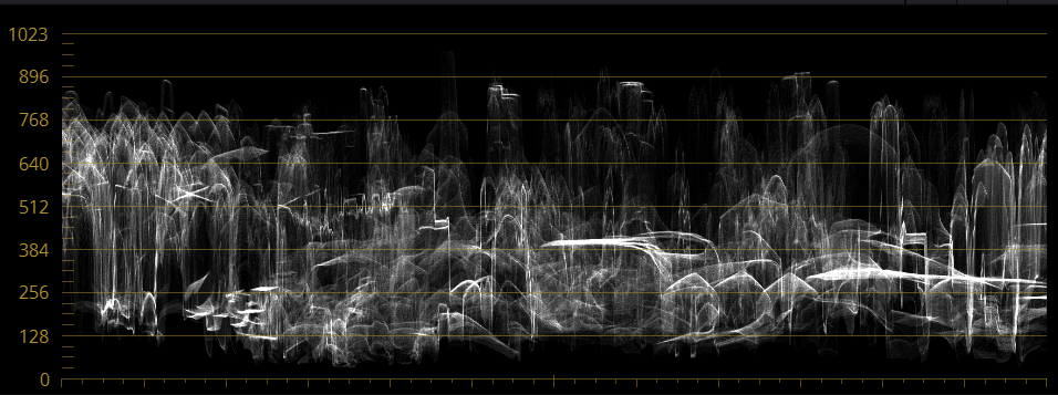
But we don’t want to go too far! It’s important to be mindful of the luminance levels while adjusting the colour wheels. We want to avoid having the shadows touch the 0-line and generally aim for the bottom of the waveform to be between 0 and 128, and the top to be just under 896.
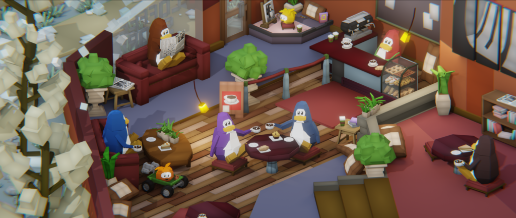
Now that we’ve achieved a nice balance, let’s take a moment to appreciate our efforts. Although the image may seem mostly unchanged, the subtle tweaks we’ve made can have a big impact. For example, take a look at how the previously overwhelming highlights have been toned down just the right amount!
Nodes
Let’s get creative with nodes! Nodes are like steps in our image manipulation, allowing us to separate our alterations and experiment freely.
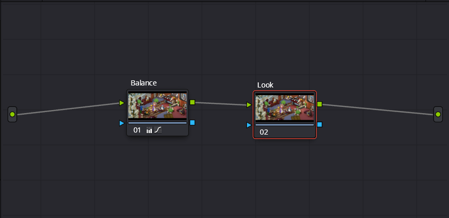
Here, I’ve set up two nodes. The second node, which I’ve labelled “look”, is where we’ll apply a creative colour grade!
A quick tip: you can use the shortcut ctrl+D to quickly disable a node! That’s useful for quickly seeing a node’s effect on your image – does it make things look better or worse?
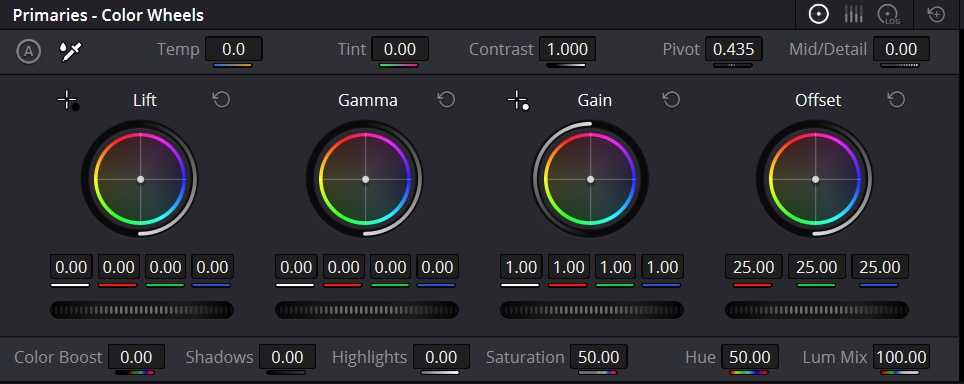
Let’s increase the contrast very slightly. I’ll increase the contrast parameter to 1.1 and then increase the pivot value to around 0.6. The pivot value prevents overly strong highlights from increased contrast – a higher pivot means a stronger clamp on highlights!

Let’s give those colours some extra flair and vibrancy! With the help of the colour wheels, we’ll pump up the amount of cyan in the image by sliding the offset wheel. But we don’t want to overdo it! To balance things out, we’ll shift the shadows to a reddish hue by moving the lift wheel.
As you work your magic on your image, don’t forget to toggle your current node on and off using the shortcut ctrl+D. That way, you can easily see if you’re making progress!
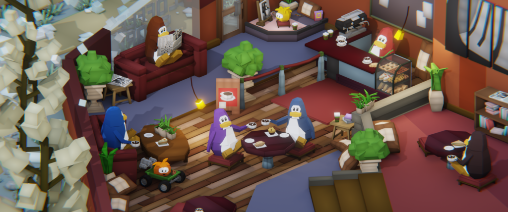
Check out the image now! The colours pop and are more vibrant. We’ve also created a striking contrast between the cool blues and warm reds in the scene. A few tweaks can make such a difference!
Don’t worry if the changes don’t jump out at you yet. You’ll set it when we get to the comparison at the end!
Let’s not miss out on adjusting the midtone detail parameter! This feature can help sharpen your image by increasing the contrast in the detailed areas. We want to see all the delicious treats on the bread shelf with clarity – that’s what we’ll achieve by increasing the midtone detail value. On the other hand, negative midtone detail will give your image a more minimalist and blurred-out look. So, experiment with this parameter to see the difference it can make to your image!

And that’s a wrap! Although we’ve covered a lot of ground in Davinci Resolve when it comes to color grading, there’s always more to explore and discover. Who knows what kind of stunning images you’ll be able to create with a few tweaks here and there?
Take a look at this animated comparison of the original and altered image. By enhancing the colours, the scene comes to life with a sense of depth, making all the elements stand out in their own unique way.
In conclusion, colour grading is a great way to take your photos or artworks to the next level. DaVinci Resolve offers a variety of tools to help you achieve a balanced, vibrant image that stands out. By visualising the luminance and using the colour wheels, we can make subtle adjustments that have a big impact! Nodes provide an opportunity to experiment with creative colour grading techniques, such as adding vibrancy and contrast to specific colours.
With the help of this guide, and the wealth of resources available online, you too can take your images from good to great. So go ahead, experiment with colour grading, and watch your images come to life!
Thanks for reading, and see you in the next article!